Overview
Client American Honda Motor Co.
Duration August 2019 - May 2020
My Role UX designer reporting to Assoc. UX Director & Creative Director
Responsibilities Created the user interaction model and interface for this tool, including all artefacts from discovery to development
Core Team 1 UX Designer, 1 product strategist, 1 art director, 1 account supervisor, tech and analytics as required
Goals Streamline user flow from different entry points - Shopping Tools (ST)* Dropdown or Build & Price (BAP)* Tool and improve the layout to increase engagement & reduce user frustration
*Please note all abbreviations as I will continue to use them throughout the case study
UX Challenge
Shortcomings with the old payment calculator:
- poor usage of space
- cluttered interface, clunky
The main challenge was to figure out how to integrate PE with the rest of the Honda ecosystem ie. Build & Price (BAP) & Search Inventory (SI) so the user doesn’t have to start over when they navigate from one tool to the other and be able to successfully print their work or share with anyone.
Results & Outcome
USER STORY
“As a person interested in learning more about what kind of vehicle I can afford, I can easily access a payment calculator that allows me to understand and refine monthly payments for a lease or financed purchase, as well as refine the monthly payment impact of accessories/add-ons and special offers.”
SOLUTIONS OVERVIEW
All shopping tools are integrated - user is able to seamlessly carry the work done and data in individual tools (say BAP > PE > SI) to others and vice versa
Key functionality now shows in the landing viewport - minimize scrolling on mobile with efficient use of real estate
Payment breakdown info is persistent with an animation to show the calculation for instant feedback to the user; made MSRP and monthly payment values prominent
Improved click efficiency particularly to show how offers affect the monthly payment
Streamlined the tool in 3 steps with clear Call to Actions at the payment summary
The Design Process
PHASE I - DISCOVERY
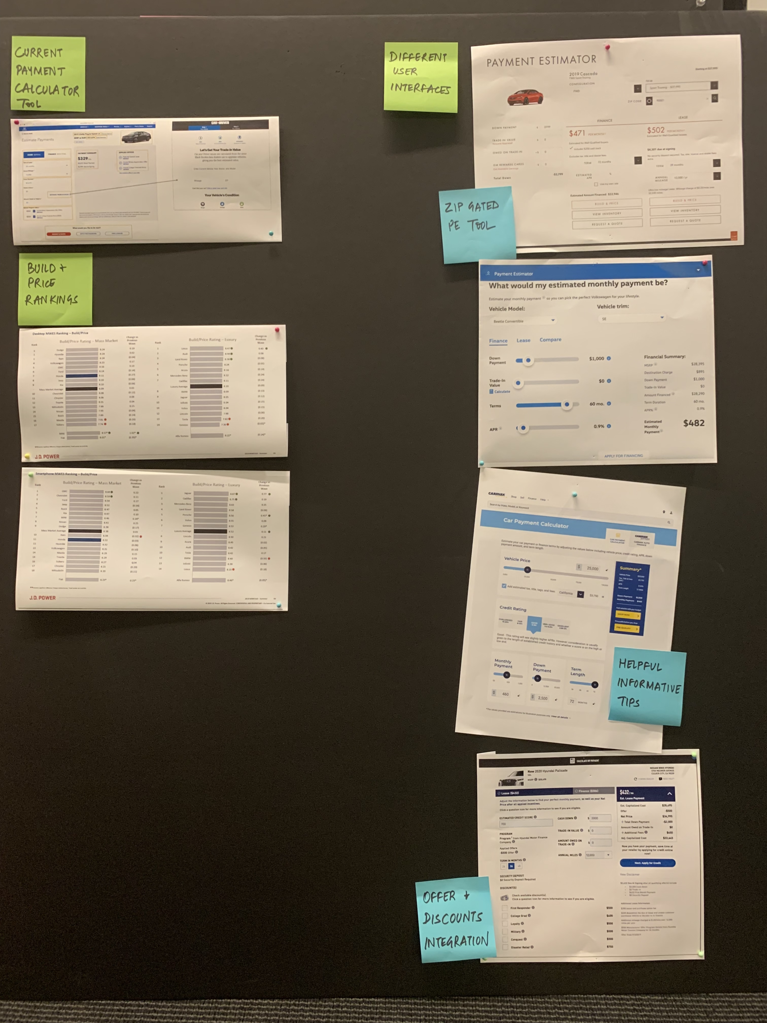
Competitor Analysis
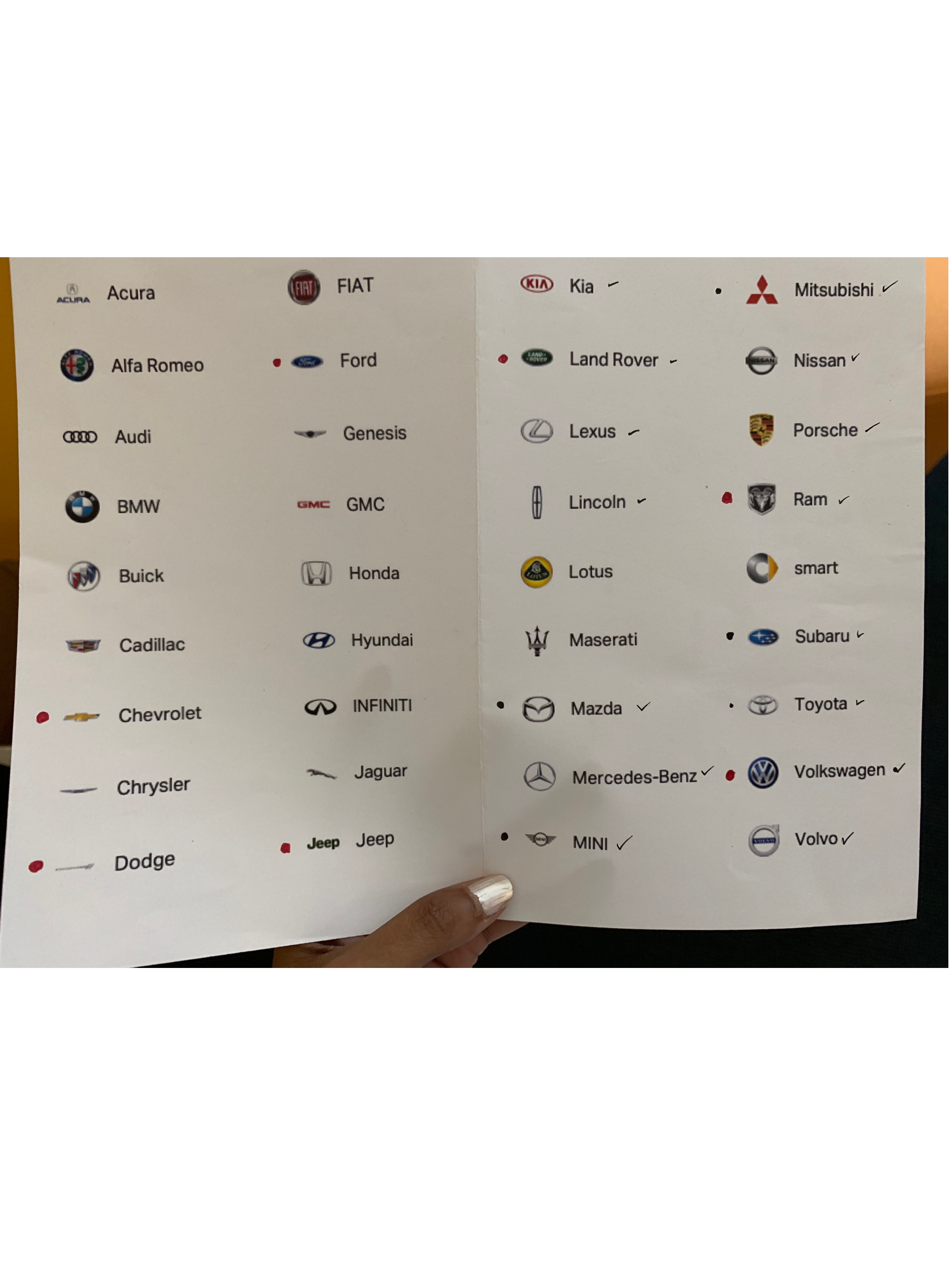
My first task was to look at more than 30 other competitors in the auto industry (OEMs and other used-car retailers like Carmax) and several other mortgage calculators, etc. to further analyze how payment calculators were approached and identify issues apart from the challenges listed above.
Along with interesting UI executions, I identified certain themes across the board.
Most PE tools across OEMs had the option to see how the credit score affects the monthly payment
When users came from the shopping tools dropdown, they were able to change their vehicle without leaving the PE tool
Some luxury OEMs like Merc Benz, Jaguar and Porche allowed the user to pop into the PE tool at any time of the BAP process and carry that personalized calculation back to BAP as they continued to customize the dream car
Most BAP tools had a summary dropdown which would show the Lease & Finance monthly breakdown at all times (along with the applied offers)
Some would let you save your calculation along with the build. Many would allow to email and print.
Some like Toyota were able to incorporate a mini PE tool (w/ offers) within their BAP Summary
Mitsubishi had the PE and SI tools incorporated in the BAP Summary
2. User flows crystalized the two distinct paths
It’s important to note how PE tool must co-exist with other shopping tools - esp. Build & Price (BAP) tool where people start building their dream car and Search Inventory (SI) tool where they eventually search for it online - in the Honda ecosystem. The PE tool acts as an effective intermediate step that can help the user make a decision and lead them further down the purchase funnel.
Per analytics, majority of the traffic to PE comes from the BAP tool and only a fraction from ST dropdown. We must, however, design for both flows to support the architecture of the site.
So I created these user flows to showcase how distinctly different the paths are and how the primary goal here is to lead them to the SI tool.
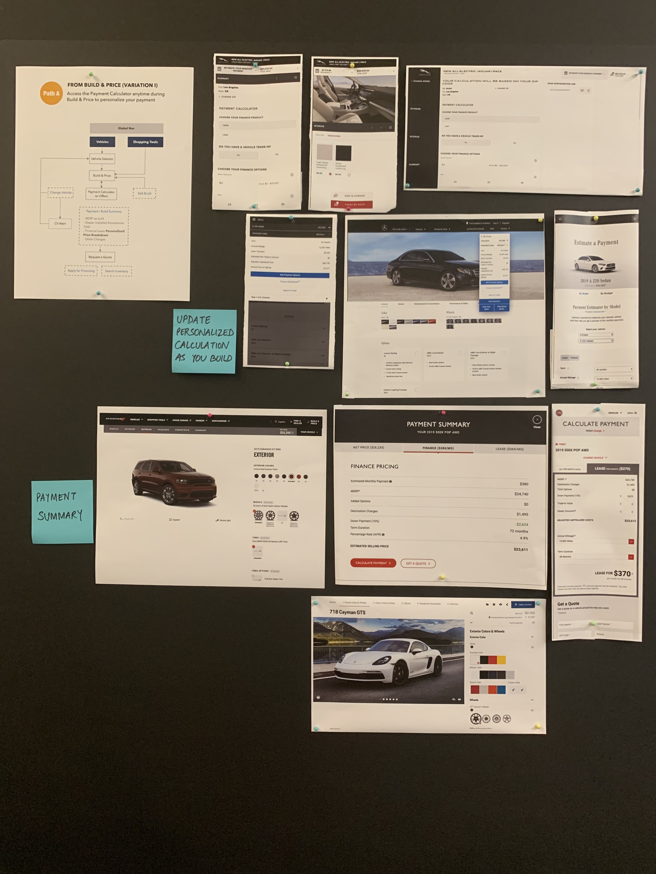
3. Working Session with the client
I decided to put forth all our research on foam boards (as shown above) instead of a digital presentation so that our first work session with the client feels scrappy and they can be involved in the design decisions early on. These boards had different illustrative examples along with the user flows (below) to guide the discussion. We used post-its to identify themes and highlight features we liked.
FROM THE SHOPPING TOOLS (ST) DROPDOWN
FROM THE BUILD & PRICE (BAP) FLOW
PHASE II - DESIGN EXPLORATION
Since we had a really tight schedule for actual design work and had very clear business and design goals to achieve, I jumped straight into design explorations. The idea was to keep feedback loops short and actionable in every sprint so that the clients could be close collaborators in the process.
The approach was mobile-first since the majority of the overall traffic to the site is from mobile.
The PE tool has key elements that directly impact the calculation of the monthly payment and some of these elements need to be bunched together. So we divided the tool into the following sections:
A. Vehicle Info Section: Vehicle name, trim, starting MSRP and change vehicle/trim
B. Input fields: Down Payment, Trade-in, Terms of lease/finance, Mileage/APR
C. Offers: Lease/Finance offers, Special program offers
D. Payment Summary: Itemized summary with next step CTAs like SI, RAQ, email, share and print
Breaking it into sections provided the flexibility I needed to play with the hierarchy and priorities.
ROUND #1
I presented 2 options for layout and hierarchy to the clients in the first round.
Lease-Finance toggle with the payment breakdown at the very top that updates real time as the user changes values
Calculator, Offers & Payment Summary as cards that are stacked as the user scrolls through the page
Option 2: Wizard Approach w/ Trade in
PE tool is divided into 4 sections per wizard approach: Payment | Trade-in | Offers | Summary
Applied offers are included in the Payment section and other optional offers are in the Offers section
ROUND #2
The wizard approach was the winner between the two options so I made some changes per feedback
Streamlined the tool to have 3 sections instead of 4 section - Payment | Trade-in | Summary by moving Offers into the Payment section as it directly affects the monthly payment (User can start with any section; order is not linear)
Trade-in becomes it’s own section with the flexibility to integrate the Black Book Tool inline in the future (concept of an ‘expanding’ calculator that would show additional functionality if the user opted for it)
ROUND #3
UI & visual design clean up especially in the Offer ribbons in the Payment section
Line items in the payment summary are in the order that reflect an exact calculation from the starting MSRP to Vehicle price at signing
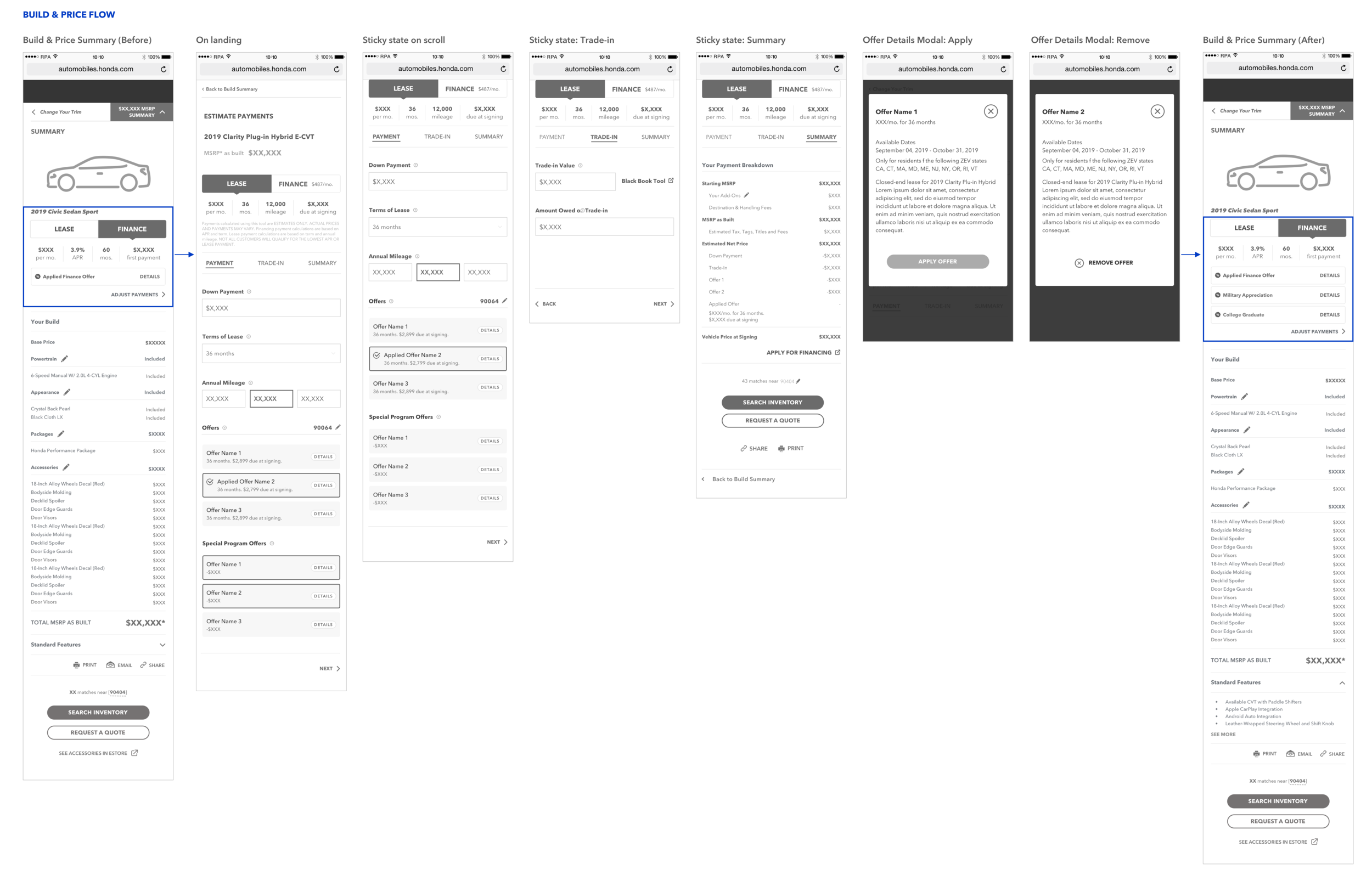
WIREFRAMES FOR THE BUILD & PRICE FLOW
When the user goes from BAP Summary > PE,
I included a PE component with a quick link to ‘Estimate Payments’
PE component consists of the lease-finance toggle, the payment breakdown, applied offer ribbon
I kept the UI consistent with the PE tool to maintain visual continuity
When going from BAP > PE, ‘MSRP as built’ would be carried to PE tool
When the user goes from PE > BAP Summary,
The PE component is populated with the new payment breakdown values
All the offers applied by the user show as stacked offer ribbons
I kept the UI consistent with the PE tool to maintain visual continuity
Quick link to ‘Estimate Payment’ remains as is
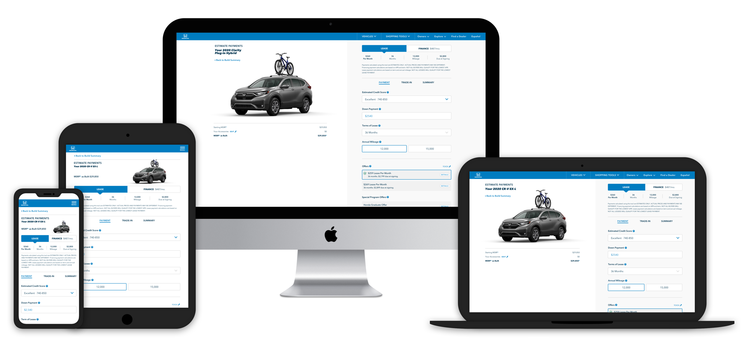
DESKTOP ITERATIONS
FINAL DESKTOP WIRES
Desktop is divided into 2 columns
Vehicle info on the left stays frozen
3 sections on the right follow the same interaction model and sticky behavior as mobile
PHASE III - USABILITY TESTING
Since PE is complementary to the BAP process, we decided to test the efficacy of PE tool for when
the user is coming from the BAP flow. We worked with a 3rd-party UX research company for this.
I prepared a test objectives document that would help inform the test plan and the moderator’s script.
Methodology: 1:1 individual interviews (remote - national)
Device: Mobile only
No. of participants: 14
Time: 60 minutes
Key research objectives and results:
Assess whether participants can successfully navigate to the PE from the Build Summary - YES
Assess whether participants understood how to navigate to each section within the tool - YES
Assess whether participants understand all of the info on the screen and how to interact with it - YES
Identify and isolate pain points in the tool - YES
Assess whether the summary serves its purpose and aids participants in taking next steps toward KPIs such as Search Inventory, Request a Quote and Apply for Financing - YES
Findings:
Overall, the participants responded very positively to the BAP <> PE integration and PE interaction model
Usability: All participants reacted positively to the layout of the Payment, Trade-in and Summary sections. There were no big layout or usability changes required.
“I THINK THIS IS PRETTY CLEAR THE WAY THIS IS SET UP.” - P11 on layout
Navigation: Some participants overlooked the ‘Estimate Payments’ link on the BAP summary as it was not actionable enough. Visibility was a concern as well.
Most participants said they would progress to SI after PE. Some said they would ‘Edit’ build if it was made more prominent as visibility was a concern.
”IF IT WAS SOMETHING I REALLY WANTED, THEN I WOULD CHECK THE INVENTORY NEAR MY HOUSE.” - P10
Comprehension: Most understood that the tools were integrated; they understood that actions taken on the build experience would carry over to the Build summary and Payment Estimator tool and vice versa.
“I’M REALLY GETTING ALL THE INFO FROM THIS SITE WITHOUT HAVING TO TALK TO SOMEONE.
I THINK LOOKING AT THE PRICE OF THE VEHICLE IT’S CONNECTED TO THE CAR I JUST BUILT.” - P9
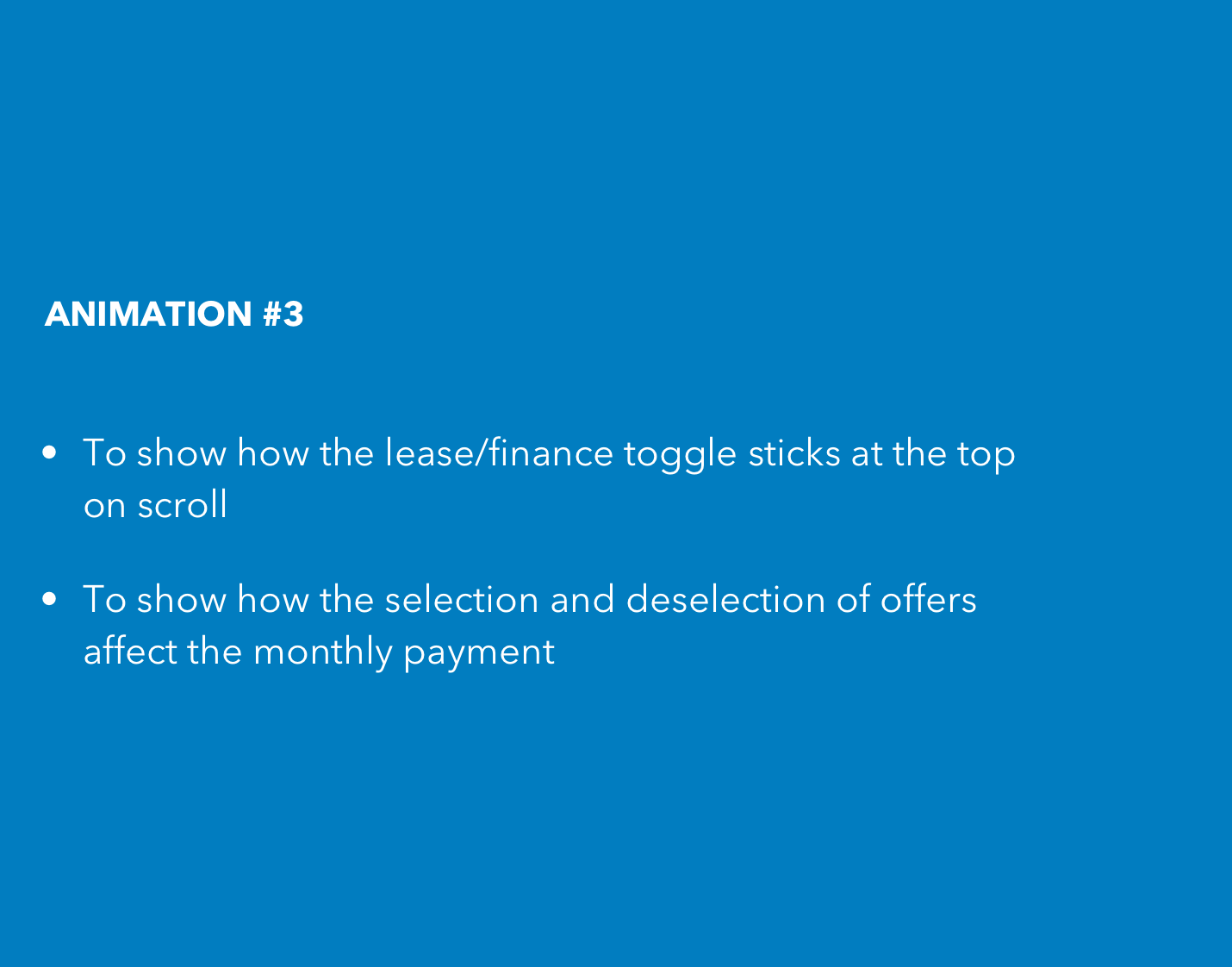
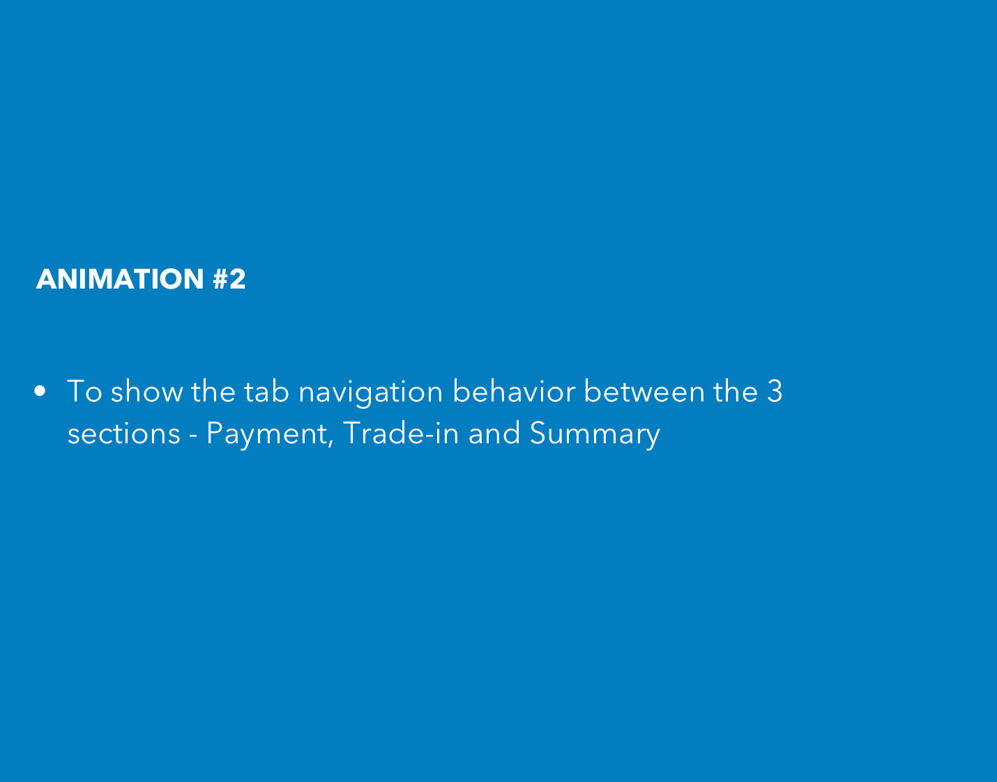
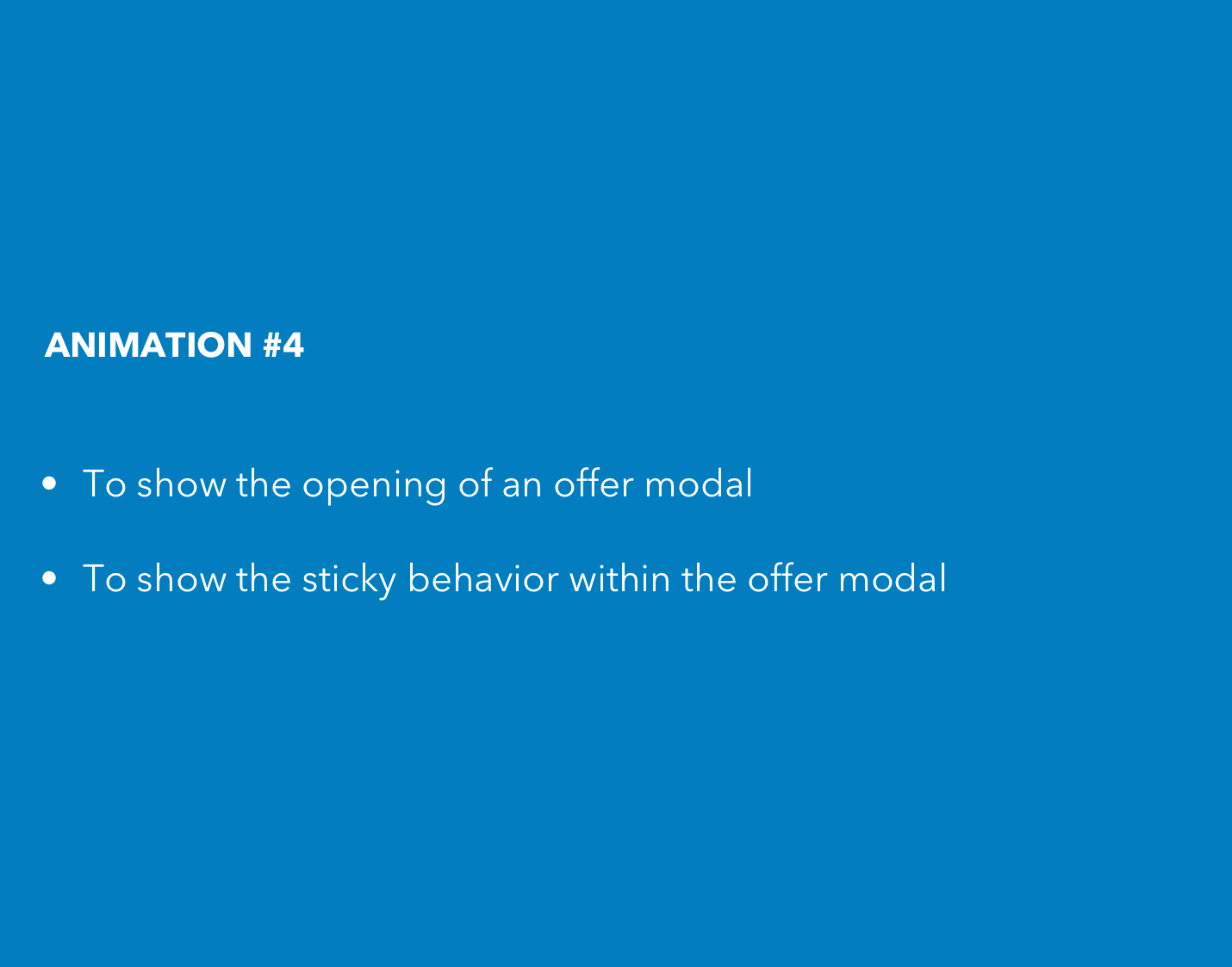
DESIGN ANIMATIONS
Our art director helped to bring the designs to life with subtle animations.
These were also extremely helpful to explain complex functionality of the final product to the developers and we added it to the functional specs for their reference.
REFLECTIONS
I often do a post mortem of the designs and the process that led me to it. Here are my reflections on the PE redesign project:
The new design can accommodate including the credit score input field to the calculator logic. It would be interesting to explore the risks involved with tying that to the offers.
What remains to be considered is how integrating the black book tool in the trade-in section can help keep up the engagement on PE