Honda
Certified Pre-Owned
Website Redesign
Reimagining the online shopping experience for a
certified pre-owned vehicle
OVERVIEW
Client: American Honda Motor Co.
Duration: August 2016 - post launch iterations until Dec 2018
My Role: UX architect w/ UX Lead reporting to VP UX
Responsibilities: Redefined the user experience, created the user interaction model and interface for this tool and owned the information architecture
Core Team: 1 UX Designer, 1 UX Lead, 1 Strategist, 1 Art Director,
1 Client Services, 1 Tech
Goal: Reimagine the online vehicle shopping experience and design a
user-centric website for the certified pre-owned customers
Objectives & KPIs:
Strengthen the mission pillars: drive intent and facilitate sales
Increased # of quality leads, Usability testing & JD Power Ranking results
THE CHALLENGE
When I set out to redesign HondaCertified.com, the fact that the website needed a fresh look and feel was very obvious given how dated it look.
However, the real challenge from a UX perspective was to use this opportunity to identify the pain points in the online shopping process and put a new spin on the experience entirely. The site needed a data and research driven approach that would change the experience for the customer and differentiate Honda in the CPO segment.
OLD HONDA CERTIFIED PRE-OWNED WEBSITE (2016) - WAYBACK MACHINE EDITION
RESULTS
The redesigned user experience resulted in a significant improvement in KPIs post launch specifically, a 39% YOY increase in Inventory Search Results and a 16% YOY increase in avg. time spent indicating an improvement in overall site engagement
40% YOY increase in Vehicle Detail page visits and 47% YOY increase in
Contact Dealer indicating an increase in qualified sales leads
*All data as of July 2017 post new site launch in May 2017
KEY INSIGHT
I learned an important lesson through my research and by collaborating with strategy: when shopping for a vehicle, people are more focused on the vehicle itself - the right color, the right model, the interior and styling, the features and technology - not the various guarantees, warranties or program perks that come with it.
UX CHALLENGE
This Insight — that it’s all about being able to find the right car — was my anchor as I approached redesigning HondaCertified.com. It guided every aspect of my iterative, dynamic process, and gave every member of our cross-disciplinary team a singular focus we would often return to through round after round of revision and development.
SOLUTION OVERVIEW
As a result of the redesign efforts, here were the solutions we landed on:
A redefined information architecture with primary focus on Inventory; with entries from home-page, main navigation, payment estimator, offers section & dealer locator
A robust filter mechanism in inventory page that would help the user narrow down the vehicle quickly
An innovative way to notify the user when their preferred vehicle would became available in the inventory with the new Create an Alert feature
Efficient and faster decision-making with tools like Compare and Save
A personalized experience with Geolocation & Recently Viewed on return
CLIENT TESTIMONIALS
– DAN RODRIGUEZ, MANAGER OF AUTO RE-MARKETING, HONDA
“THIS SITE DOES EXACTLY THE KINDS OF THINGS I ACTUALLY NEED WHEN I’M SHOPPING FOR VEHICLES.”
– QUOTE FROM USER TESTING
The Design Process
PHASE I - DISCOVERY
1. Content & Competitive Audit
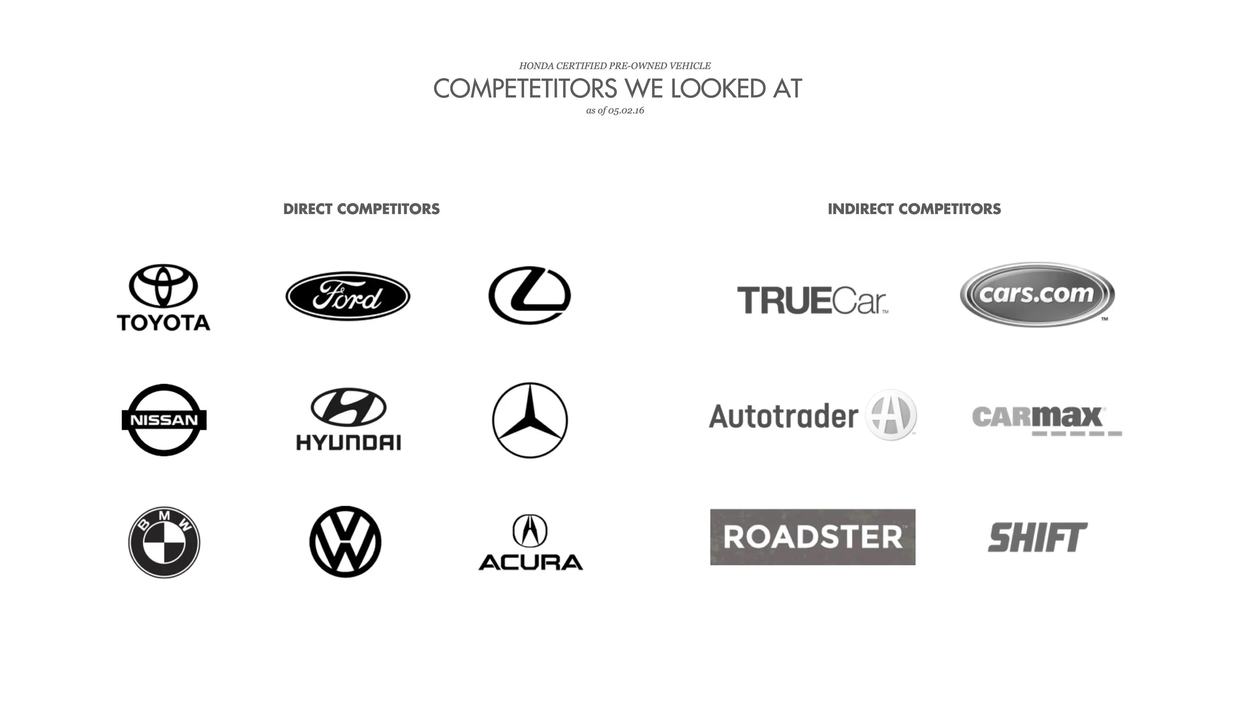
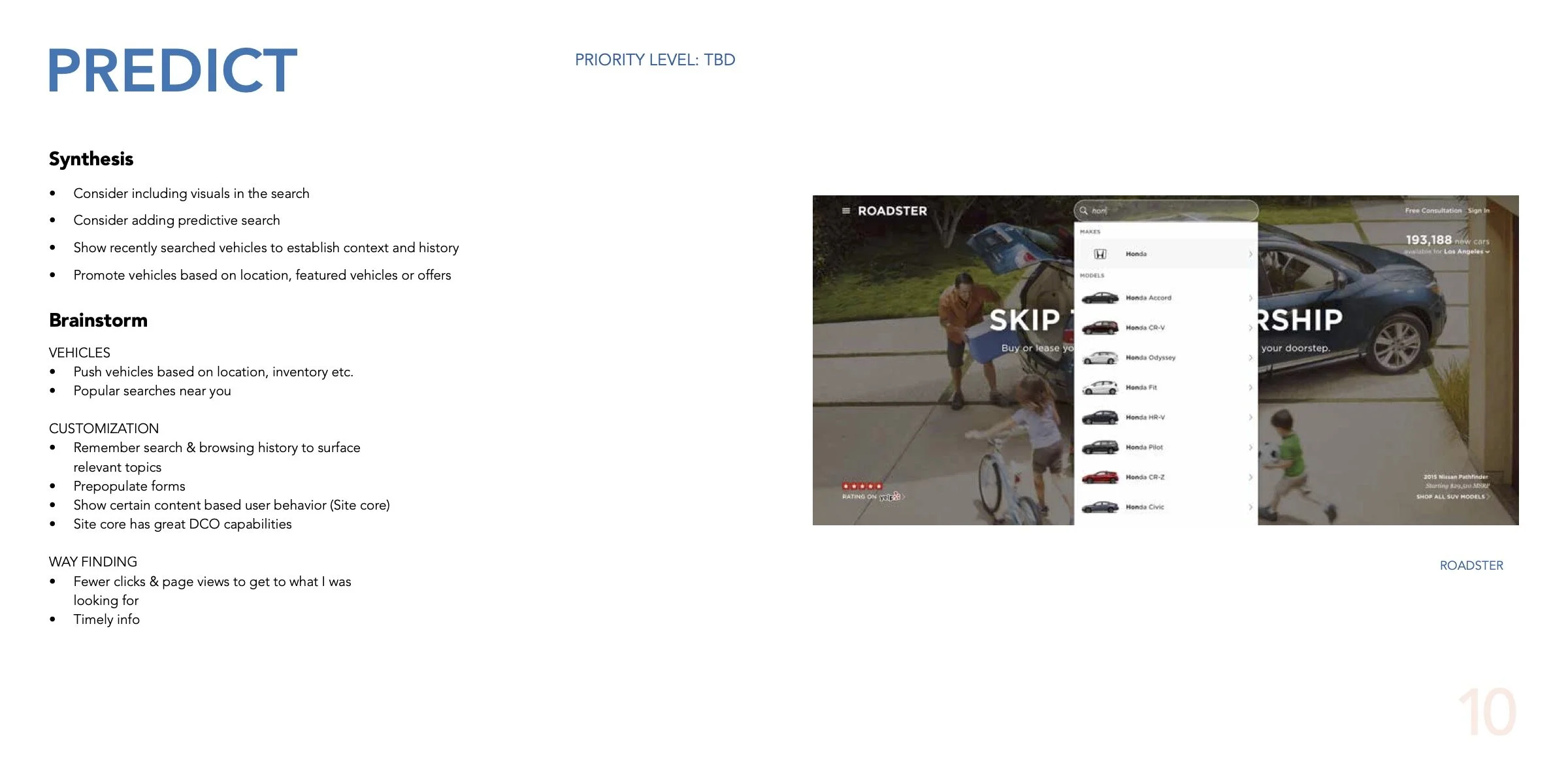
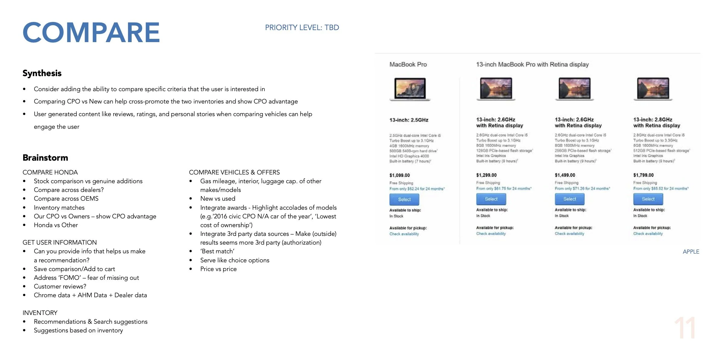
I kickstarted the discovery phase with a content audit and analyzed over 15 competitors in and out of the CPO space. While most of the car-makers had the same relentless focus on their program benefits, extended warranties and 135-point vehicle inspection checklists, the indirect used-car selling competitors like Carmax, Roadster and SHIFT were doing a much better job at getting the user to the actual inventory.
After closely analyzing the UX of these sites, I identified 12 key areas of improvement in navigation, responsiveness, design language, taxonomy, functionality like search & filters, new features & personalization across the site. You can find the key Insights & Opportunities here in this deck that was presented in the 1st working session.
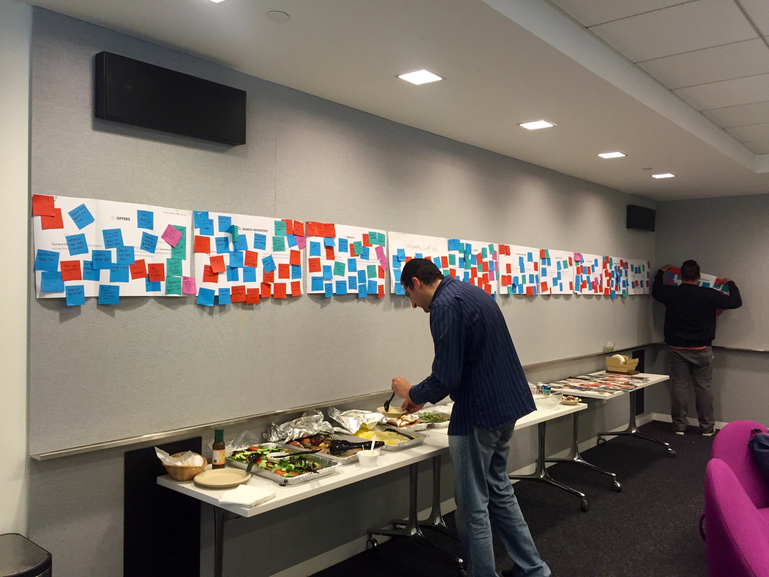
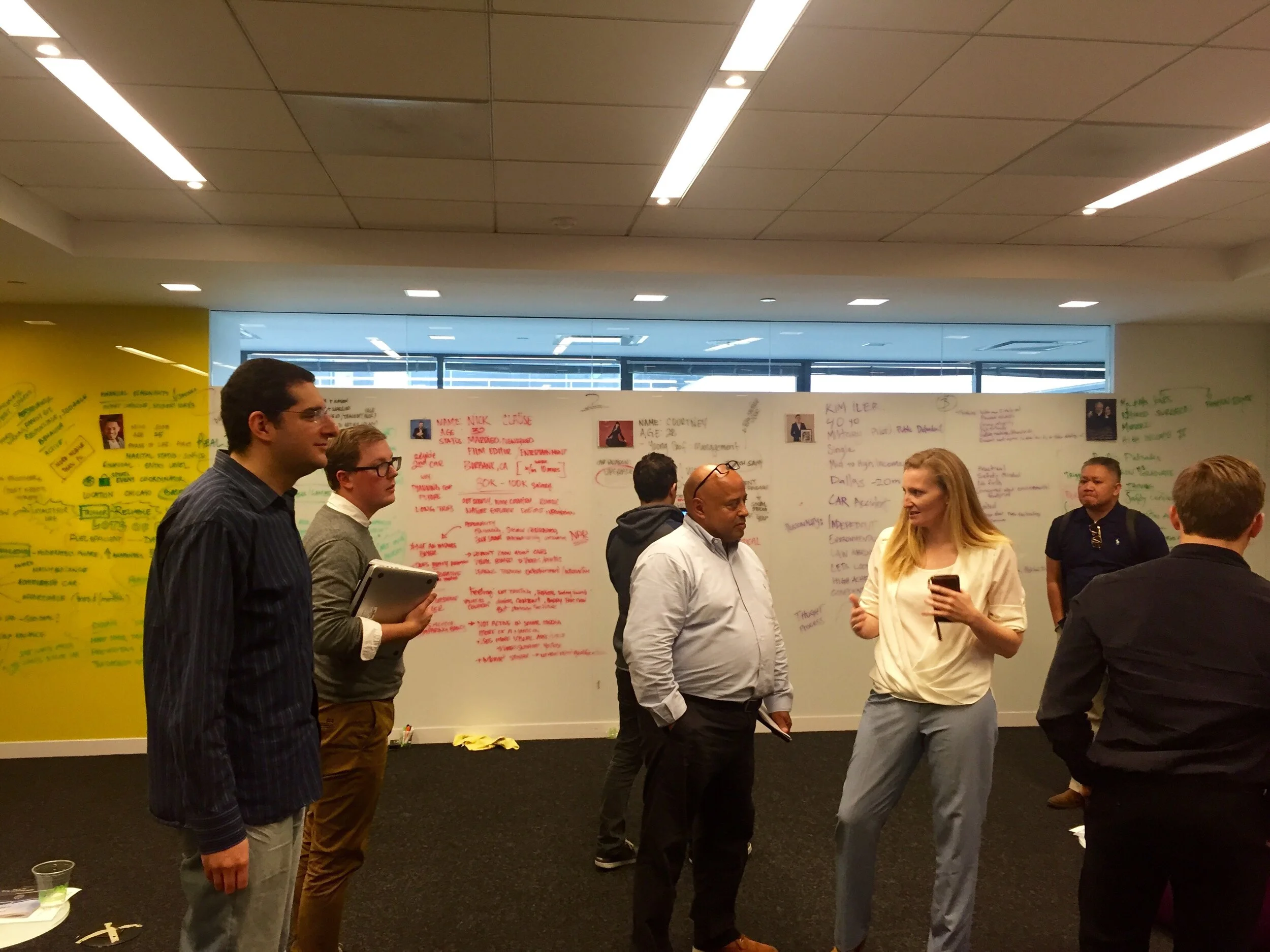
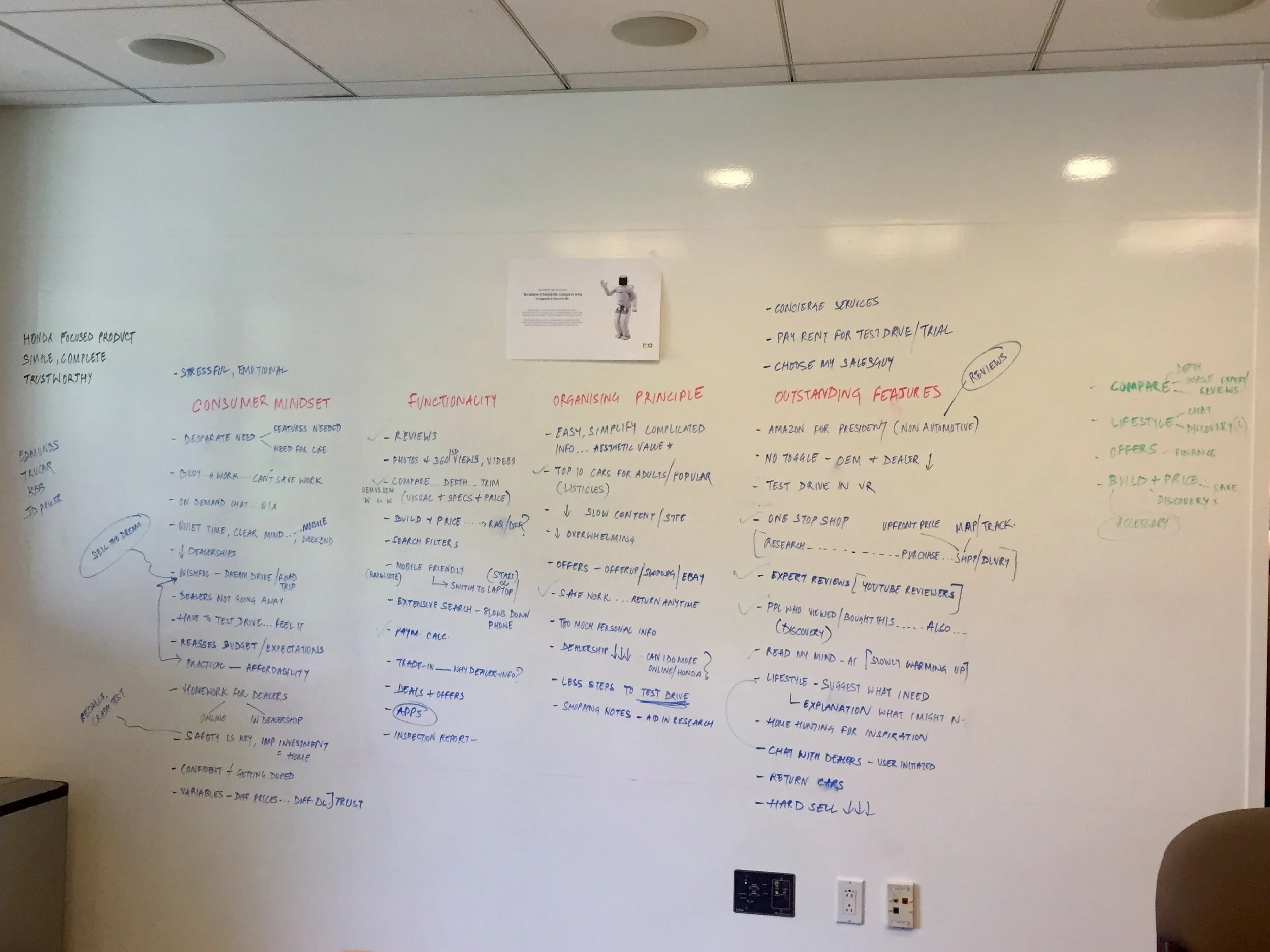
2. First Working Session
I decided to conduct a card-sorting exercise to identify any themes the client had in mind in addition to those I had from my content & competitive research.
This was a collaborative exercise with the market research, strategy, client servicing, UX, tech team members and the clients in the room. The aim was to facilitate a discussion between the internal stakeholders and the clients about the business goals of this website and involve them in the design process early on.
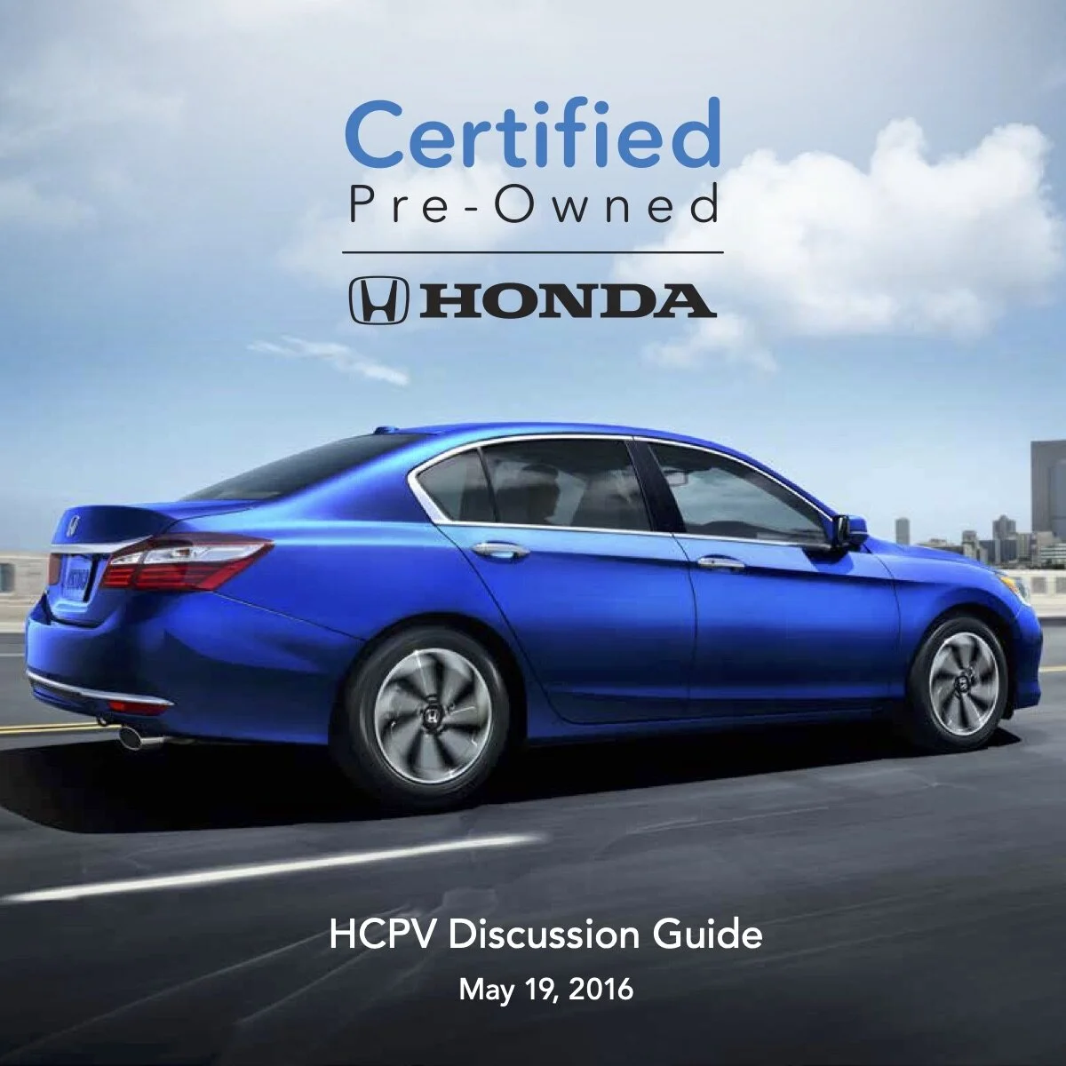
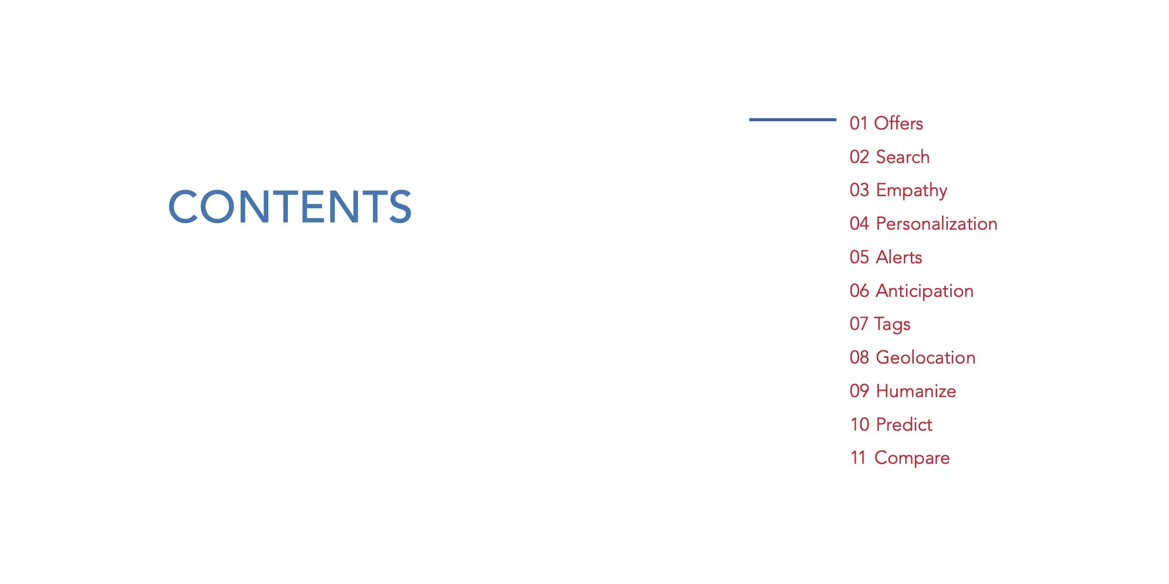
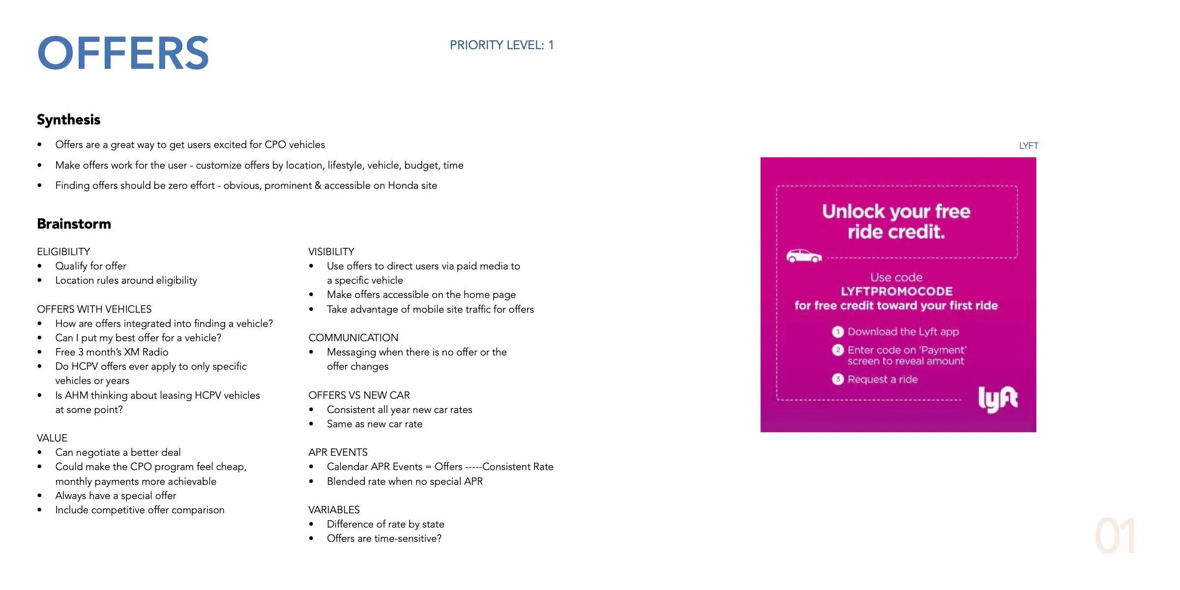
3. Discussion Guide for the 2nd Working Session
I prepared a discussion guide that would synthesize the ideas coming out of the 1st and give us a final set of themes to work with.
In the 2nd session, we had a follow-up discussion about the prioritization of these themes to align with the business goals. The idea was to have some tangible set of new ideas - that would be focused on humanizing the site and building trust - to keep going back to as we go into the design sprints.
See below the Discussion Guide or here is a link to it.

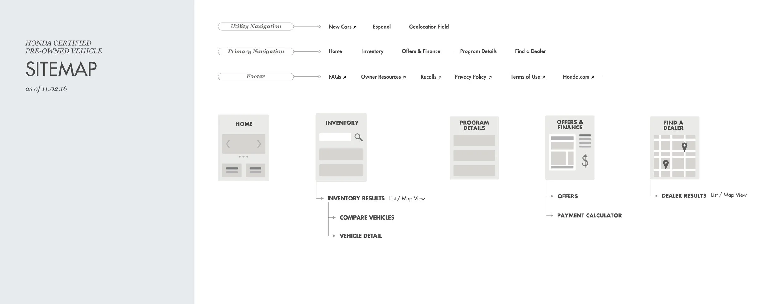
4. Information Architecture and Sitemap
The working sessions with the stakeholders validated the research findings:
Real people don’t care about the program benefits and warranties as much as we might think. That information is valuable to have from the business perspective and helps build trust online, but users really just care about finding a car to fall in love with - and would want to know program benefits in context of the vehicle they’re interested in
People care more about the specifications of the car in the inventory and not a new generic model so the model library pages are an extra step to get to the inventory
People were interested in the offers on the vehicles and wanted a way to quickly assess their budget
Keeping these points in mind, I created the new sitemap. The main navigation would now have Inventory, Offers & Finance prioritized higher than Program Benefits and Find a Dealer.
PHASE II - DESIGN EXPLORATIONS
Home Page Design
The old home page had a fragmented architecture with no hierarchy which was confusing to the user as there was no clear starting point.
I kept the home page really clean and straightforward giving the user 3 different entry points into the inventory - Main Navigation, Primary Home Page CTA and the vehicles/type menu at the bottom that would filter the inventory.
I incorporated personalization elements like geolocation services and ‘recently viewed’ vehicles that would help the user pick up where they left off bringing them a step closer to their desired vehicle and contacting a dealer.
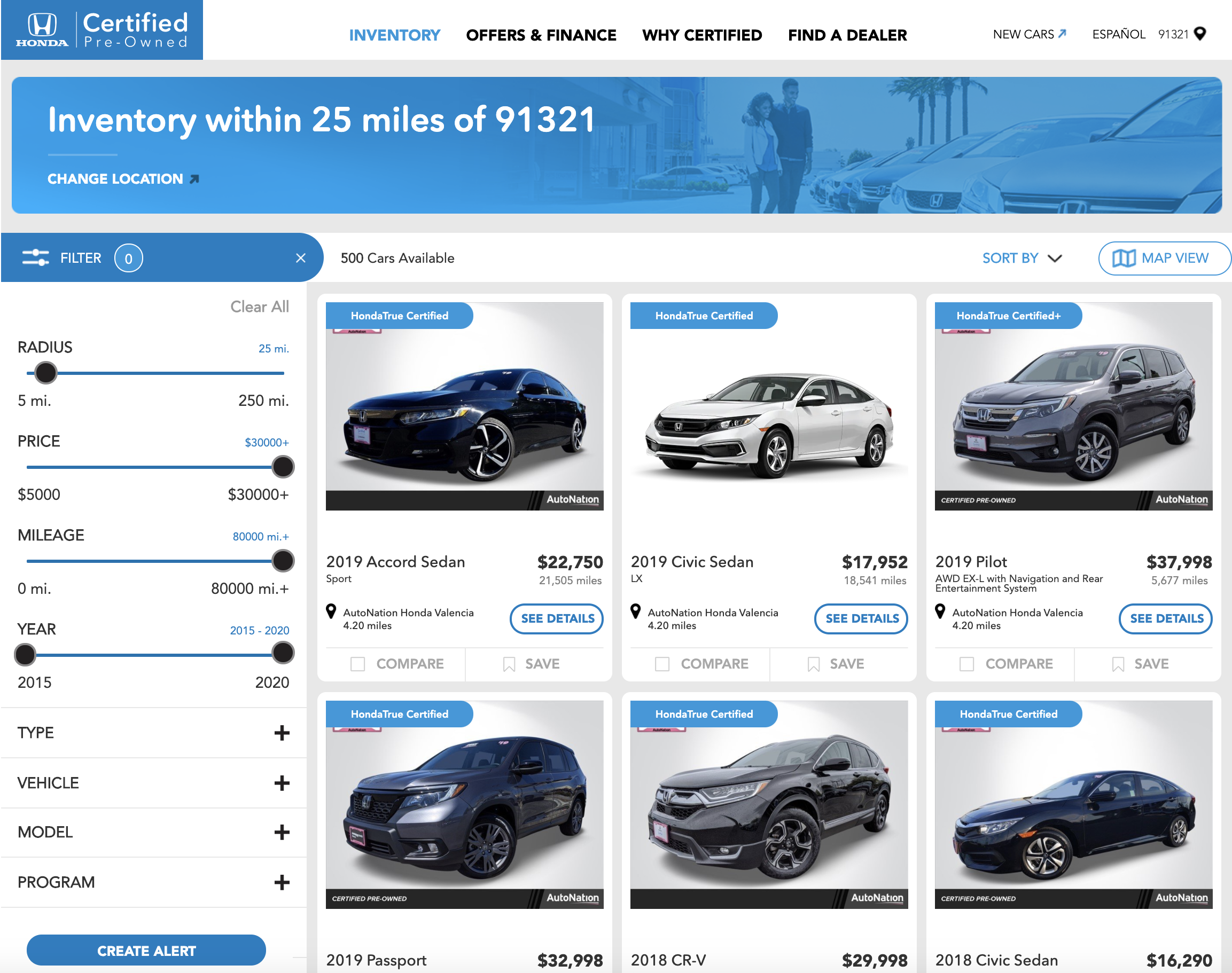
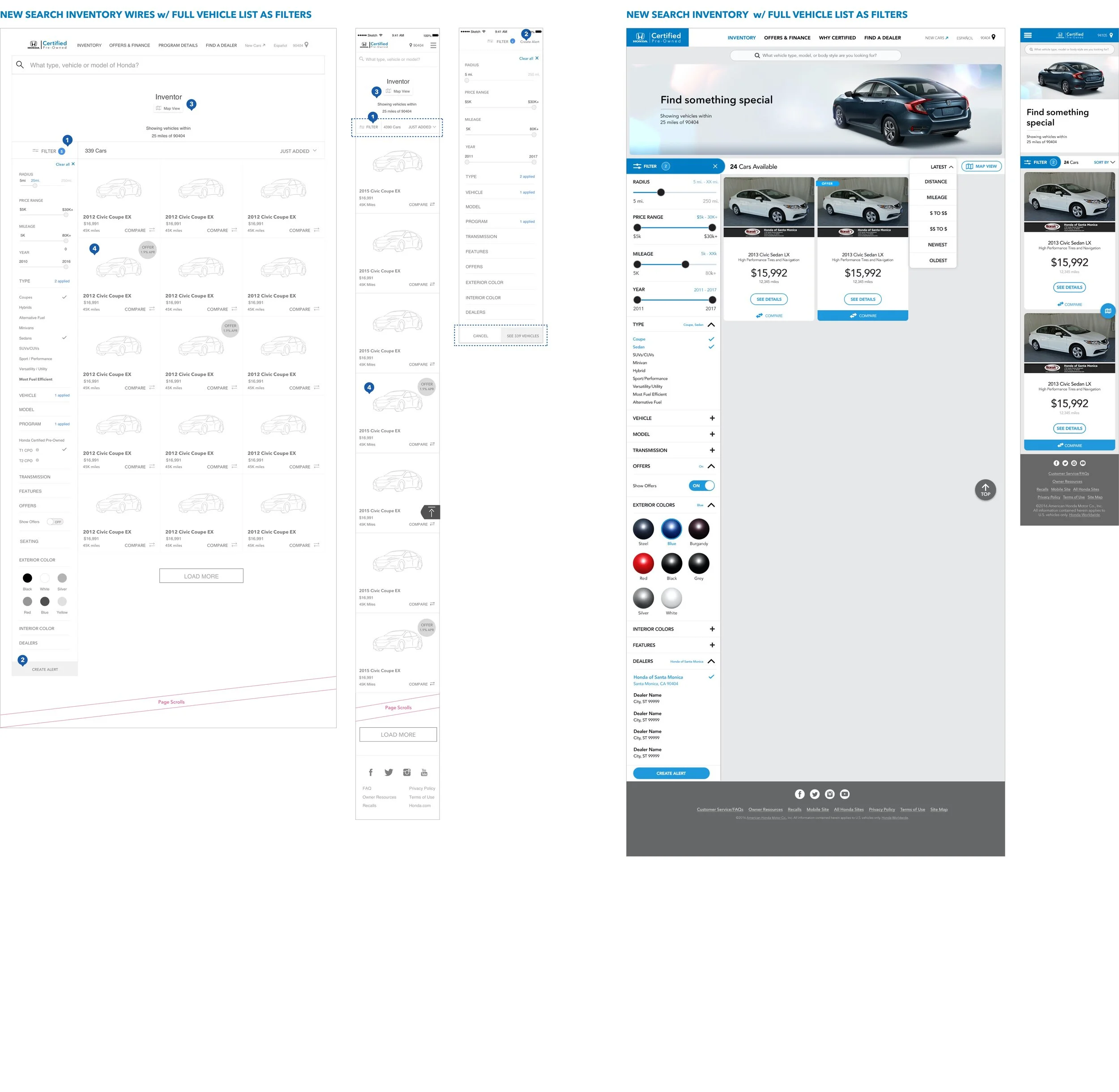
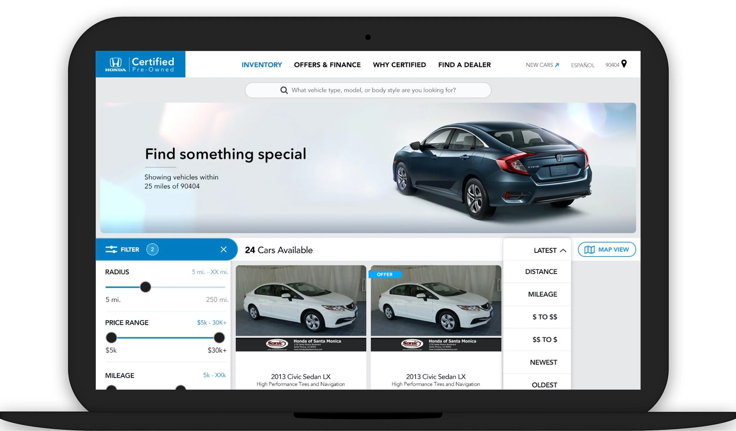
Inventory Tool Redesign
One way to get to the vehicles inventory on the old site was to go through individual model detail pages. These pages added a lot of weight to the overall architecture, especially on mobile. This path was also especially irrelevant cause the user didn’t care to know generic model info but was instead interested in the specifics of the CPO vehicle - the mileage, the monthly payment, the features etc.
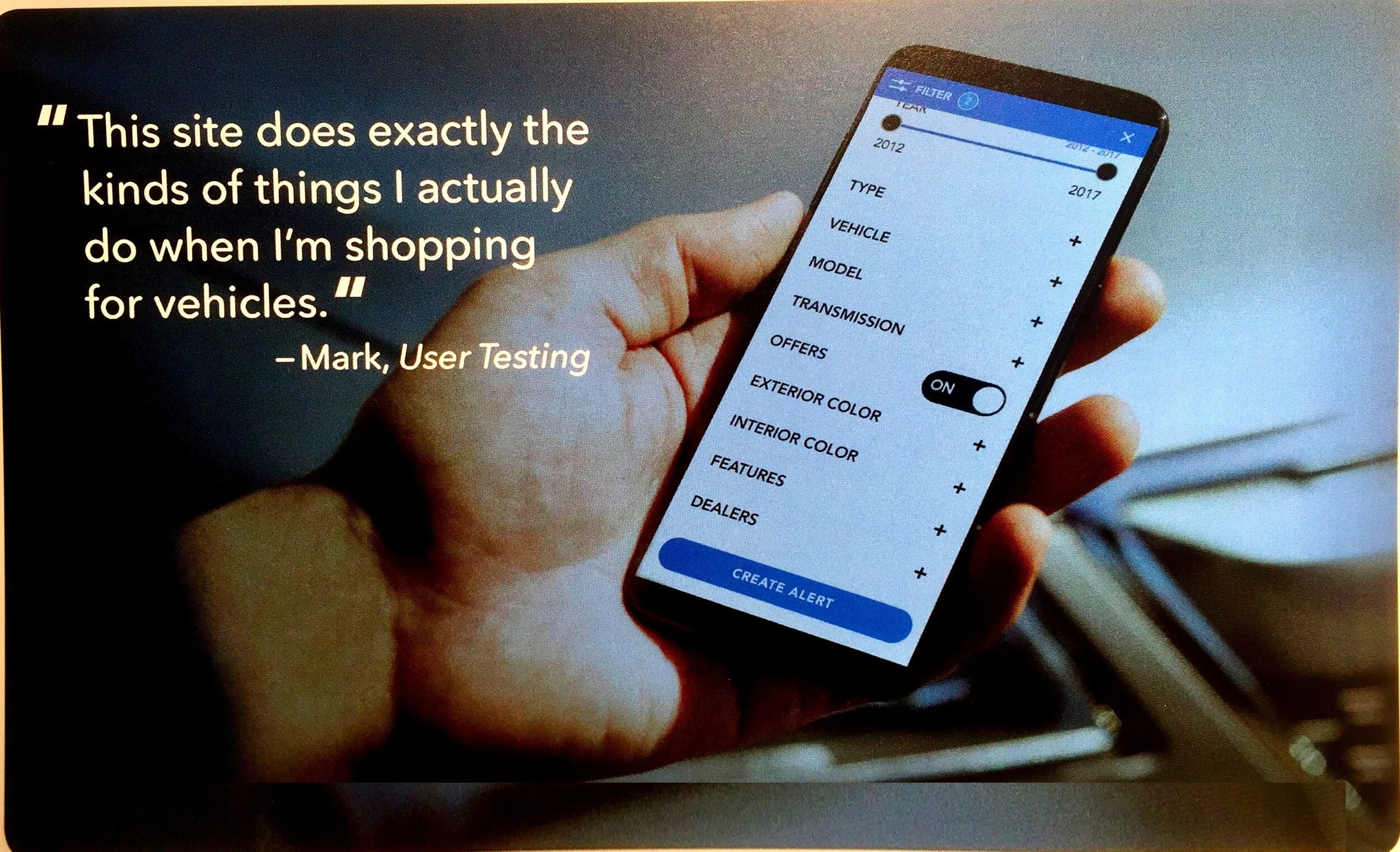
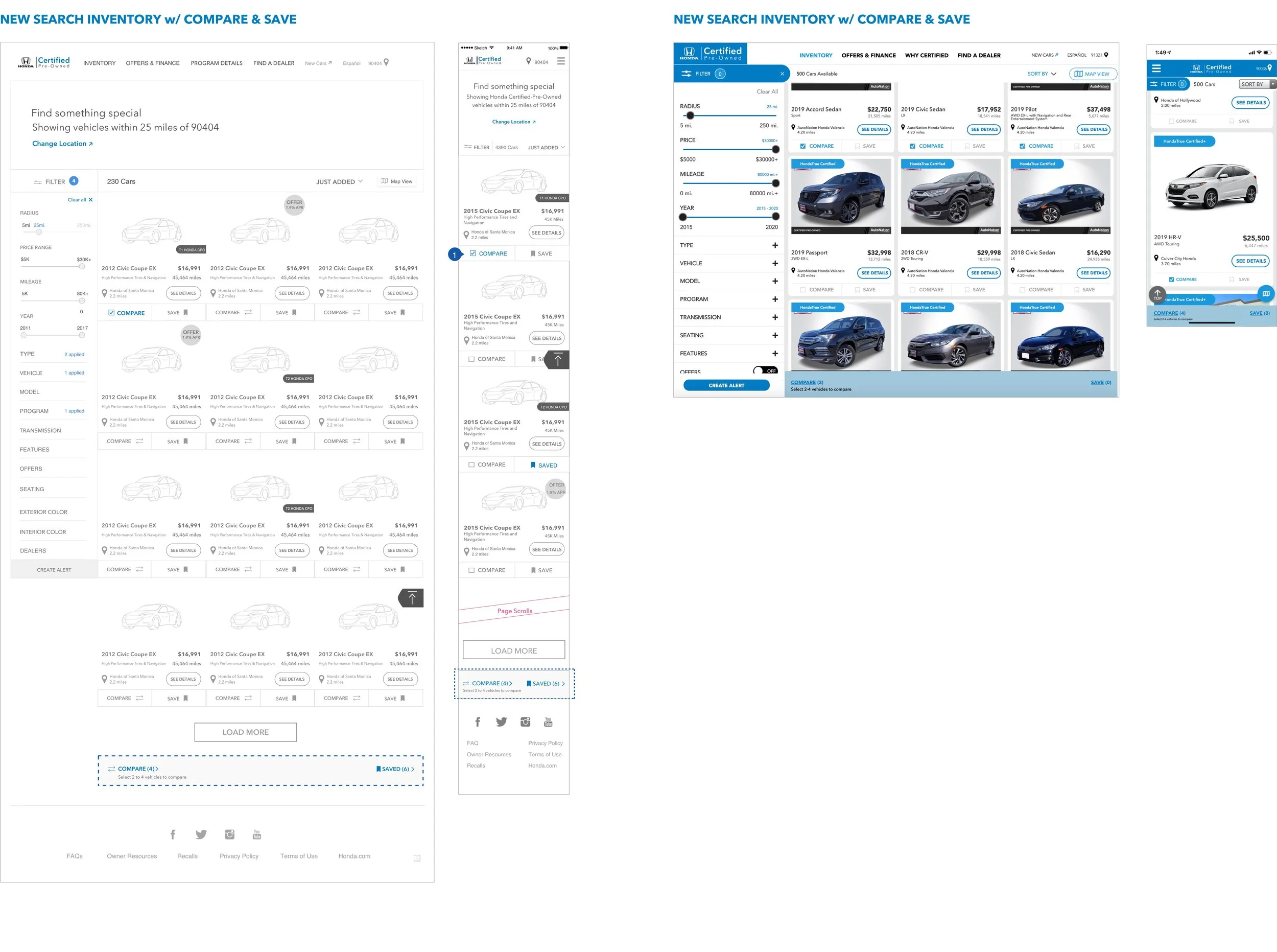
So I deleted all the redundant model pages and redesigned the inventory tool with a new interaction model to find a specific CPO vehicle quickly with the least amount of effort. The new paradigm had the following functionalities:
1. Filters: Additive & Reductive filter mechanism (e.g. color, transmission, seating, features, dealers etc.) with real time results matching the search criteria
2. Create Alert: for a vehicle matching your search criteria if not available in the inventory
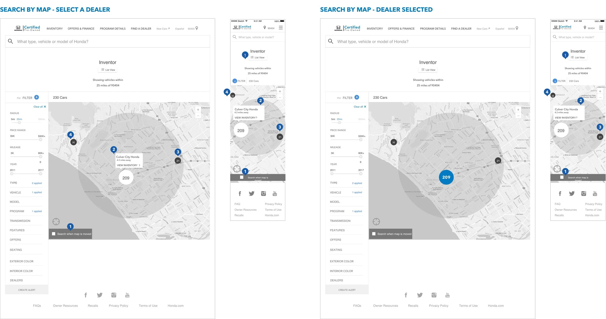
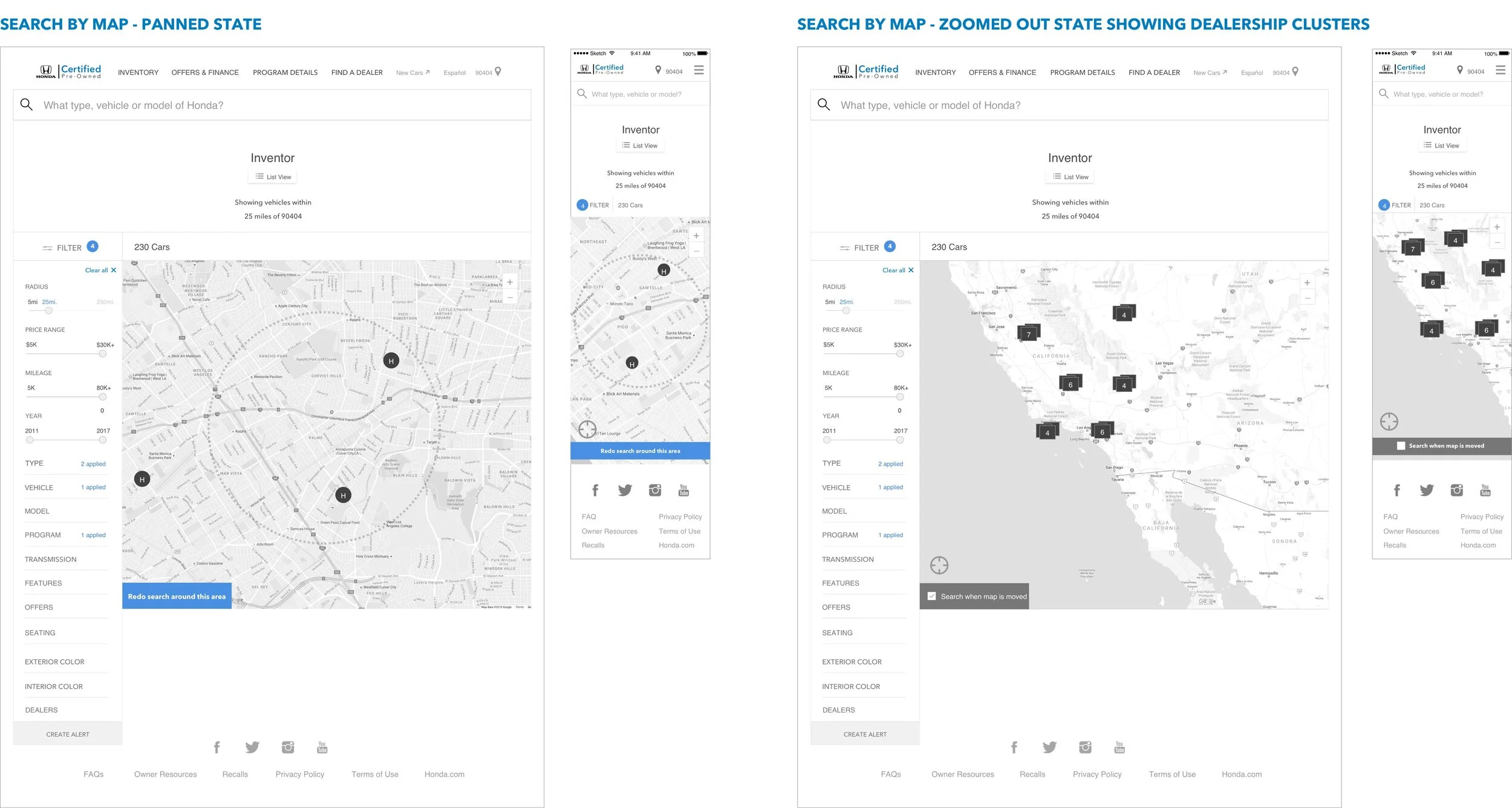
3. Search by Map: unique way to search by proximity or changing your ZIP code
4. Vehicle Tiles: Succinct info with an offer sticker when applicable
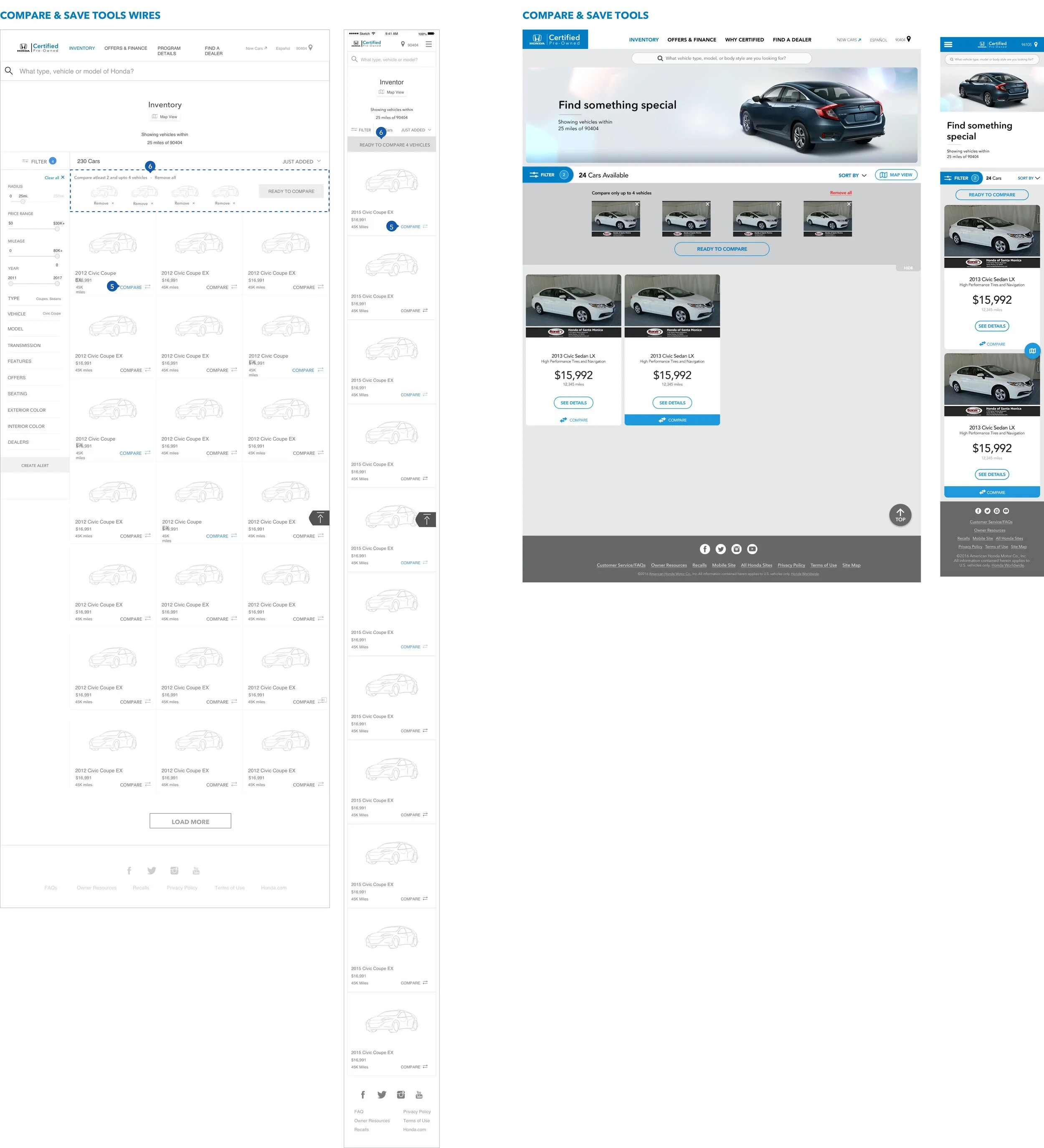
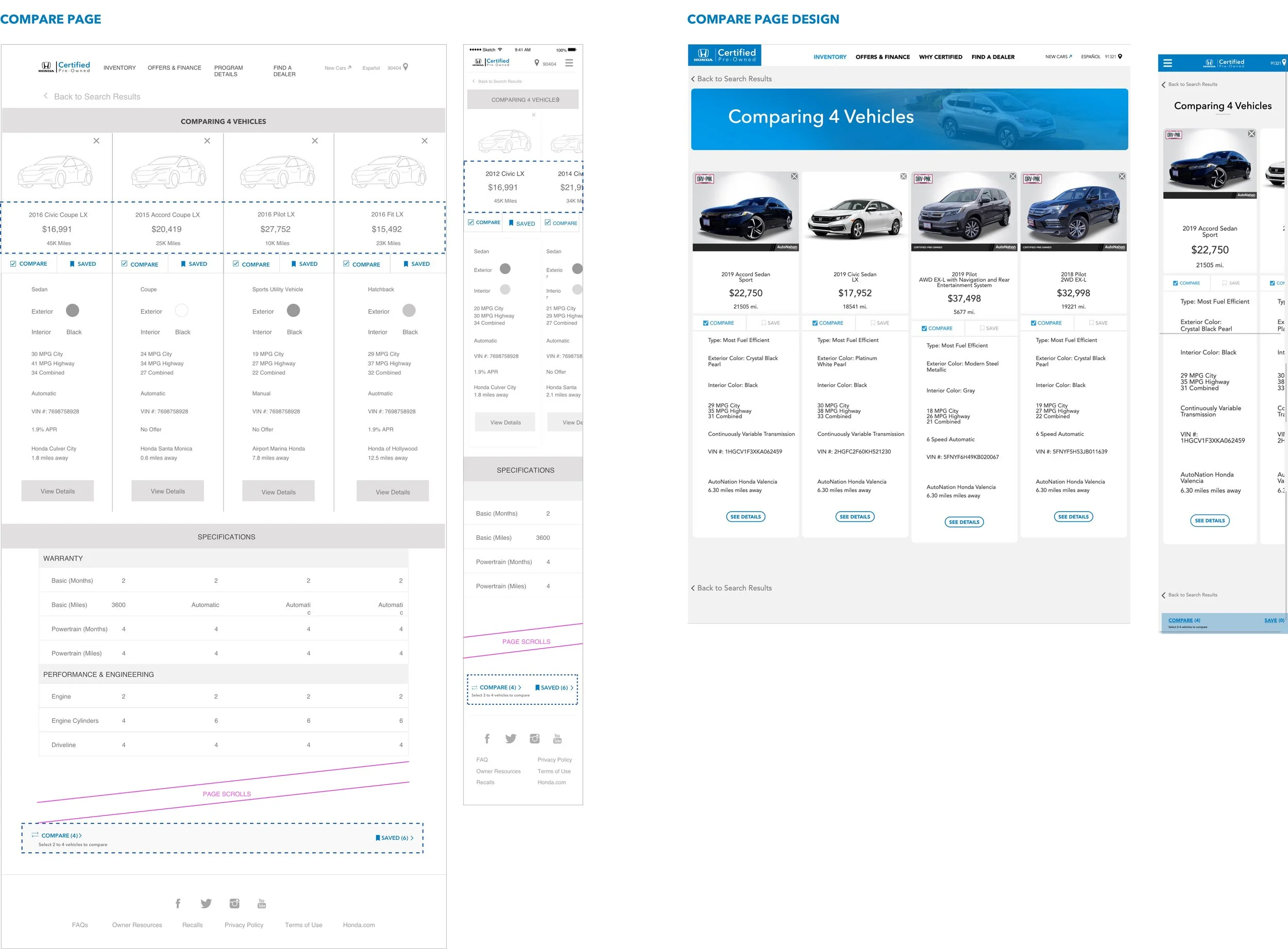
5. Compare: Allow for comparison of key info and features of up to 4 vehicles
Create an Alert - User flow and Email template for alerts
As Create an Alert was a new feature, I designed a system to workout all the possible scenarios and created a user flow to communicate the rules. I also wire-framed the email template for these alerts. The frequency and duration of these alerts can be modified at the time of creation: either a daily summary or for every vehicle added to the inventory.
‘Delete this alert’ will delete this specific alert from the system (Delete all will delete all alerts from the system)
The user’s search criteria is always populated in the email alerts along with all the matching vehicle listings
‘Extend duration’ will give the user the option to continue getting alerts for an additional 15/30/90 days
Search by Map -
I created an alternative way to see the inventory listings with the map view. Here the vehicles are clustered by dealership. This is especially helpful if the user has a dealership preference or wants to search within a limited radius without having to leave the inventory page, keeping the focus on their search and not have to start over with ‘Find a Dealer’.
View in Invision - Mobile & Desktop
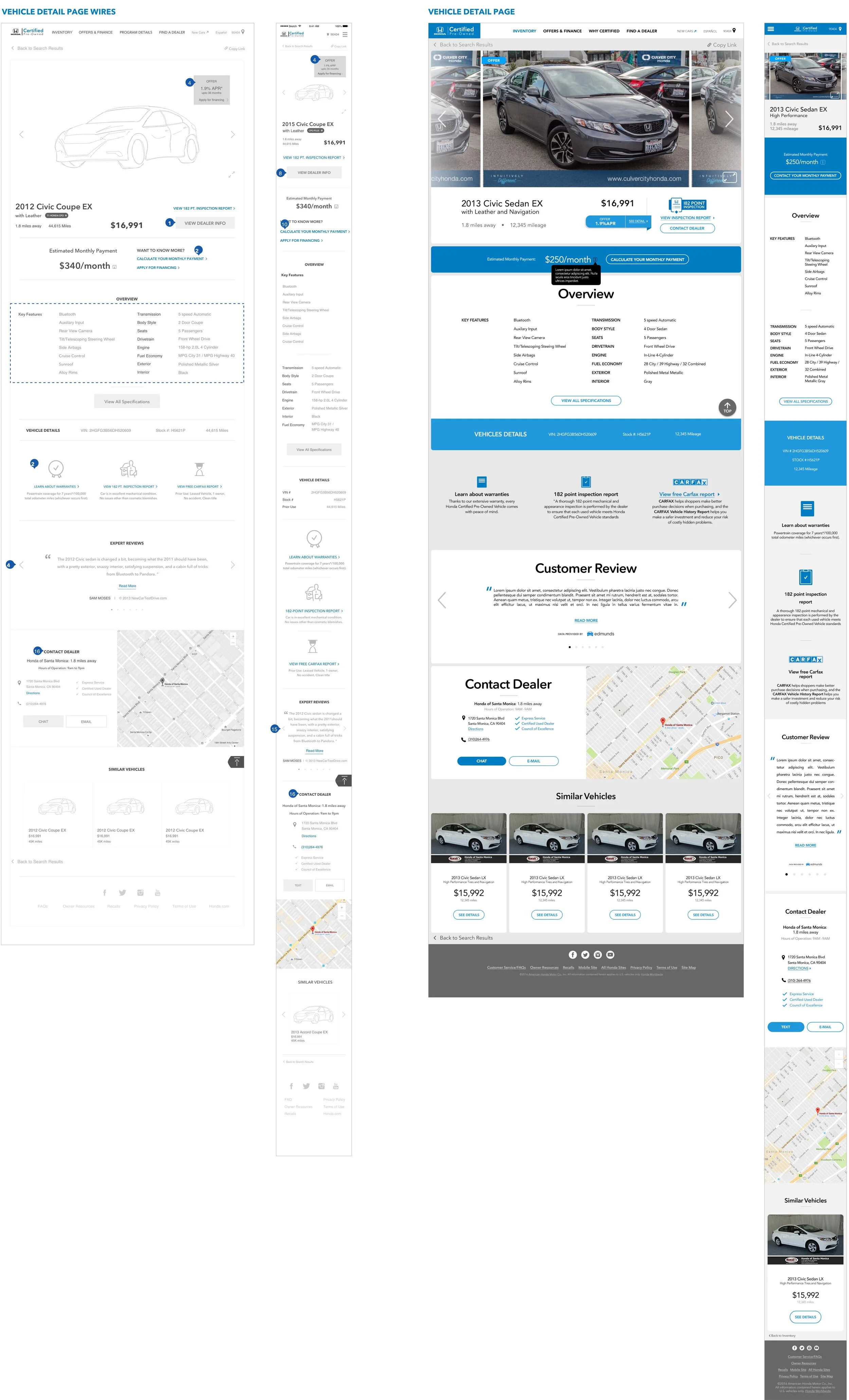
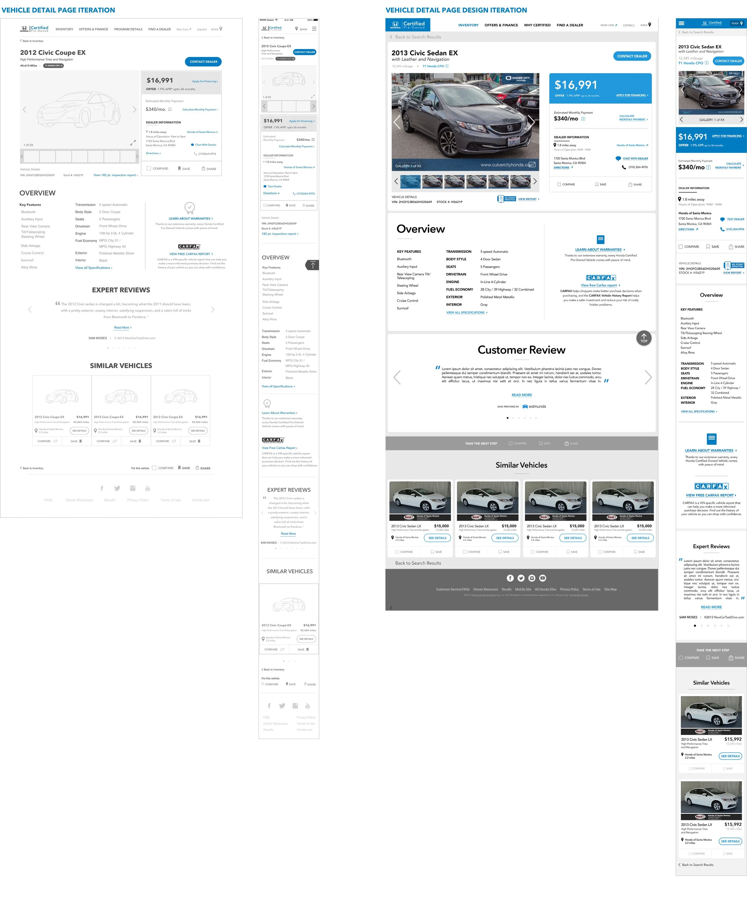
Vehicle Detail Page (VDP)
VDP was a critical part of the website as it gives all the details about the user’s preferred vehicle with the primary KPI ‘contact a dealer’.
The layout of the page was the crucial aspect from a UX perspective as we need to provide just enough information to drive the user to click on the contact CTA but also let them deep dive into other details if they wished to get more info on program benefits and such. I went through a couple iterations of the layout and landed eventually on a version that optimized for:
Space above the fold: Vehicle images, Vehicle price, Offer info, Monthly payment breakdown and a contextually placed link to the 'Payment Estimator’ tool
Vehicle info and primary CTA ‘Contact Dealer’ that sticks to the top as the user scrolls through the rest of the page; keeping the CTA top of mind
Building trust with info like the VIN#, Stock#, Inspection report along with secondary actions items like Compare, Save and Share
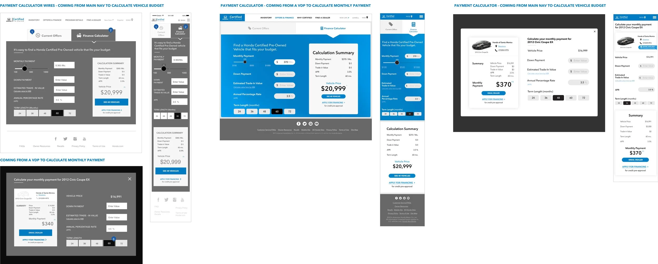
Payment Calculator Tool
The old Payment Calculator was accessible from the main navigation but did not contain any information about offers. Secondly the payment calculator was completely disconnected from the inventory.
I gleaned from research that offers was a key factor is giving Honda a competitive edge over others in the CPO space. Top that with the additional value of integrated tools; the advantage of carrying data from the payment calculator (like vehicle price applied as a filter) into the inventory or vice versa (like # of vehicles available in the inventory for a certain budget) were opportunities that were totally missed.
So I focused on creating a connected experience for the Honda user by making the three pieces - Offers, Payment Calculator & Search Inventory - talk to each other in the efforts to funnel the user down to a specific vehicle and eventually contact the dealer.
After a few iterations on the layout, I landed on Version 2.0 where the calculator and summary are both within the landing viewport easing the cognitive load for the user and directing them towards the inventory.
The calculators are slightly different from the user comes from a specific vehicle as opposed to the main nav as shown in Version 2.0.
PHASE - III USABILITY TESTING
We worked with a 3rd-party UX research company for the user testing before launch.
I provided support through out the testing sessions and prepared a test objectives document that would help inform the test plan and the moderator’s script.
Methodology: 1:1 individual remote interviews
Device: Desktop and Mobile
No. of participants: 14
Time: 60 minutes
Task Path:
Find a vehicle of choice in the inventory and contact the dealer

Findings:
Due to confidentiality reasons, here is a gist of the findings and the changes we focused on after testing.
Most described the site as “simple” and “clean” and found it easy to navigate. They said it had features and functionality they expected from the old HCPV site, except Create an alert which was new and that set it apart from other manufacturer’s websites.
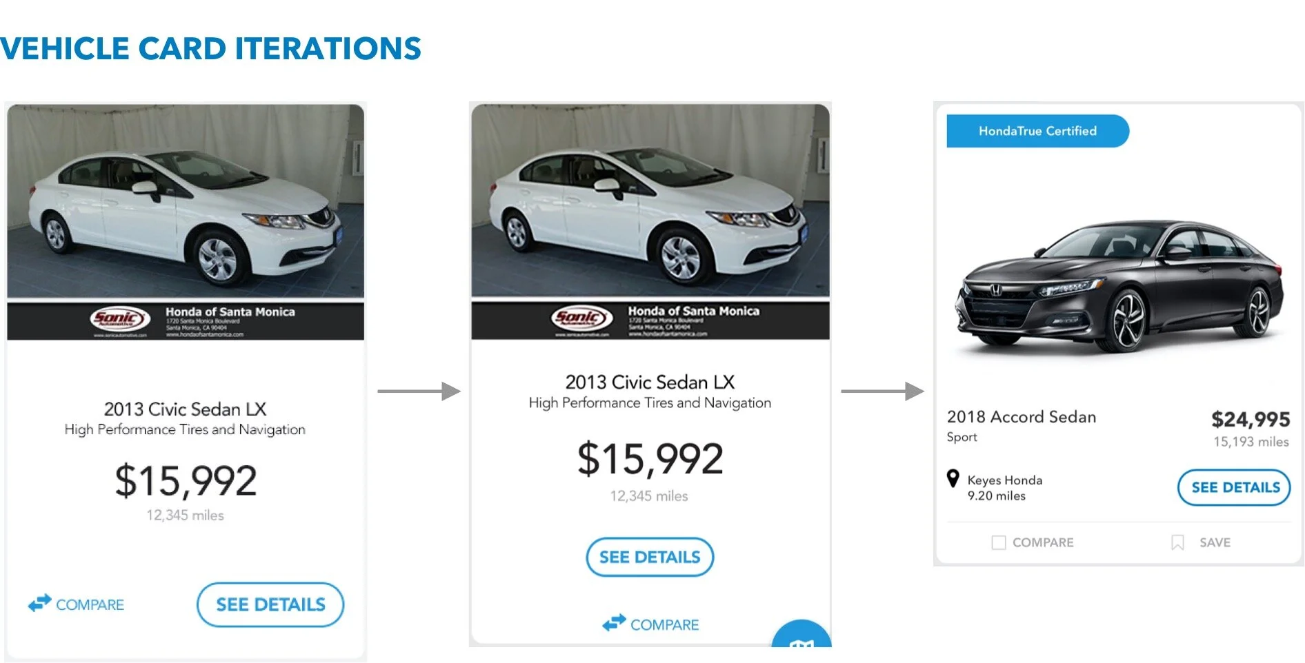
The Filters and Compare functionality were the most commonly cited aspects of the site when participants were asked what they liked or found helpful; so I incorporated Compare & Save to the inventory. (See Below)
Users preferred going to the inventory directly from the home page and using the filters to narrow down. Those that used the search tool rated the experience unsatisfactory. So we killed search as a feature.
Live site testing post launch also highlighted some key issues that made us take another at the layout of the vehicle card in the inventory, search feature, save and compare pages on the site.
Other sections that were redesigned -
Program Benefits
View wires in Invision: Mobile & Desktop
Design in Invision: Mobile & Desktop
REFLECTIONS
I often do a post mortem of the designs and the process that led me to it. Here are my reflections on the redesign project:
I would spend more time on the filter mechanism as it impacts the results in the list and map view (user-test map view specifically)
I would attempt to feature the main KPI ’Contact Dealer’ earlier in the shopping process and not just on the VDP to qualify the early converts as quality leads
Keep feedback loops short with the internal team and the clients and spend more time on iterations